Inspiration Corner
A blog spotlighting art 'n' media I've seen lately that really meant a lot to me and that I want a lil' spot to talk about!
Dec 1, 2024

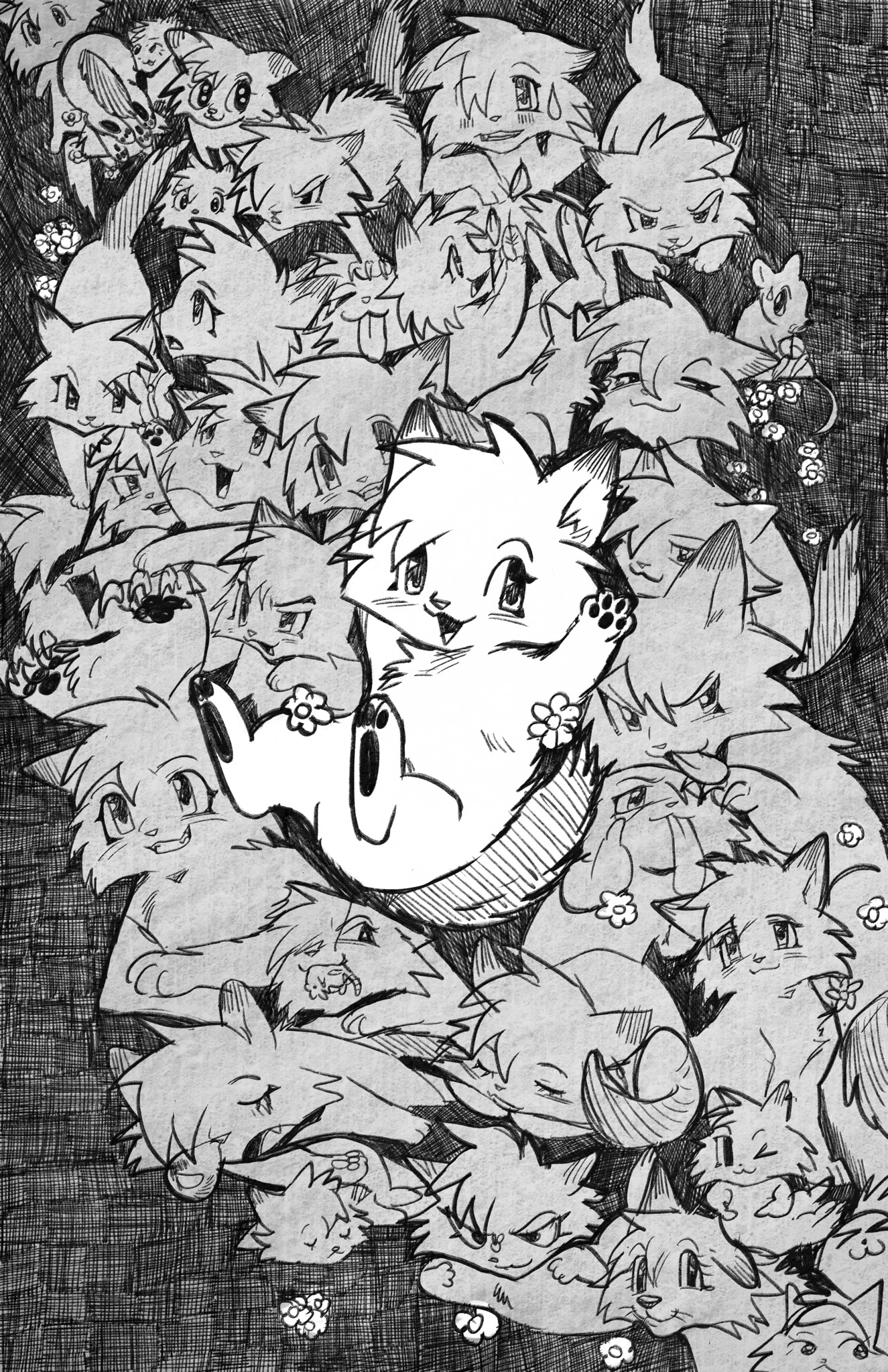
Softmio's Greystripe Collage
SoftMio.Tumblr.com
This piece is a longtime favorite of mine ever since I first saw it in 2022. Very fittingly, it was Softmio's entry for a WC Zine, and I think the theming of it is perfect for celebrating that DIY spirit of the WC art community. Along with Splatoon, WC was my first fandom that really brought me into the depths of online community spaces, even if I mostly just lurked behind my accounts and kept my drawings inspired by other artists to myself. Drawing throughout my childhood years and even now is somewhat of a private experience born out of a distant fascination with fan communities, and the pen-and-paper doodles of this piece bring me back to those middle school years when my love for the craft and the characters was divvied up among scattered worksheets, looseleaf, and messy sketchbooks. It's a deceptively simple piece - a collage of monochrome doodles with a very convincing paper filter over it - but in its details it shares such an overwhelming nostalgic adoration for this design of a much beloved WC character.
SSS Warrior Cats is one of the early crowning achievements of the fandom in my eyes. Before the current shift in scale of popular projects to the gorgeous mammoths they are today, the style of the fandom was collectively that of anime and manga (occasionally with some Lion King fans). SSS in that aspect was an apex in that age and form of inspiration, combined with some genuinely incredible art direction, and wrapped up into an ambitious animated project. There is a LOT to praise about the series, but character designs were undoubtedly one of its strengths. They were elegant yet simple and appealing to anime nerd tastes at the same time - no small feat for a purely indie fan project of the late 2000s. And despite the incredible diversity of fan designs which define the community today, people are often incredibly fond of these ones in particular. They were an early blueprint of sorts. These days a new animated WC series is in the works using a decidedly more modern and ergonomic style, with very little of that old shounen flavor. It greatly reflects the artists working on it today, a lot of whom were kids when SSS was at its peak, but whom went off and got art degrees and are returning with industry standards. Something which only makes that raw ambitiousness of SSS all the more appealing.
When I imagine the spirit of the early WC animations and designs, SSS is at the top of the list. Its not my own experience as someone who was always attracted to flexing my own character design muscles and entered the fandom in the mid 2010s, but I can imagine a child for whom SSS WAS Warrior Cats and their sort of WC anime. These iconic designs were what filled their every spare inch of paper as my OCs filled mine. The penciled style, the texture of the paper, the messy (yet skillful) linework, the poses picked are all so evocative of middle school doodles in the best way possible. The sheer volume and layering brings that of a collage across time and paper, from cute or epic poses meant to be shown off to friends to joke art meant to avoid boredom during a lecture. There is a specific kind of love reserved for comfort characters of this time in life, popped into existence to share moments with.
Some Greystripes I really enjoy are middle left one lunging from the background, a fierce stance he takes at the top left, and a goofy expression down at the bottom right. The first two really show off the flexibility of the designs that made the animated fight scenes so mesmerizing to watch, and which would definitely appeal to a kid. The middle one is especially vicious, maybe getting ready to pounce on another friends doodle or tear apart a difficult math problem. The top pose is cute yet serious, but ironically surrounded by some of the sillier Greystripes, one he even seems to be smushing the face of with his left paw. If you don't have your own character who you've begun to draw as just silly abstract shapes or with googly little expressions, I highly recommend it - very therapeutic.
The bottom one is goofy in the complete opposite direction, taking away his simplified cutesy face and giving him a big muzzle, akin to how some anime will overly detail a character's face to make them appear awkward for a gag. Or, perhaps its an attempt to draw Greystripe as a dog, just still not entirely able to get the species-swap across. Back in elementary and early middle school, I remember having a hard time getting people to tell the species of my animals apart too. Funny enough though, I think I have to credit the mid-2010s WC community for exposing me to a diversity of ways to cartoon cats which helped me learn differentiated anatomy.
In the middle is the pièce de résistance: the highlighted foreground drawing of Greystripe in a playful freefall, as if dropping right on top of the pile. Really its a lot more disconnected from the surrounding poses, more akin to him floating upon the page, simply... existing in space. The pose is more just a means to draw Greystripe one more time after running out of space, one more excuse to draw the character for the millionth time, most likely on pure instinct by now.
Collages and other labor-intensive art always enamor me with the love of the craft that flows out of the effort on display. Most often, I see this in a singular piece with painstaking detail poured into a single subject or scene, and I can't help but feel envious with my own lack of patience and eye for detail. A lot of my art has always been private because it hasn't been very flashy, just doodles upon doodles upon doodles. But this piece really captures how even that is a massive testament to adoration of the simple act of drawing, and how that joy can be expressed through something as basic as your middle school favorite from the indie animation on Youtube for those cat books you read. My body of work is not lazy or rough, it's simply divided among disparate smaller pieces crafted through an instinct to just express something, and to never stop just letting that expression flow.
Apr 21, 2024

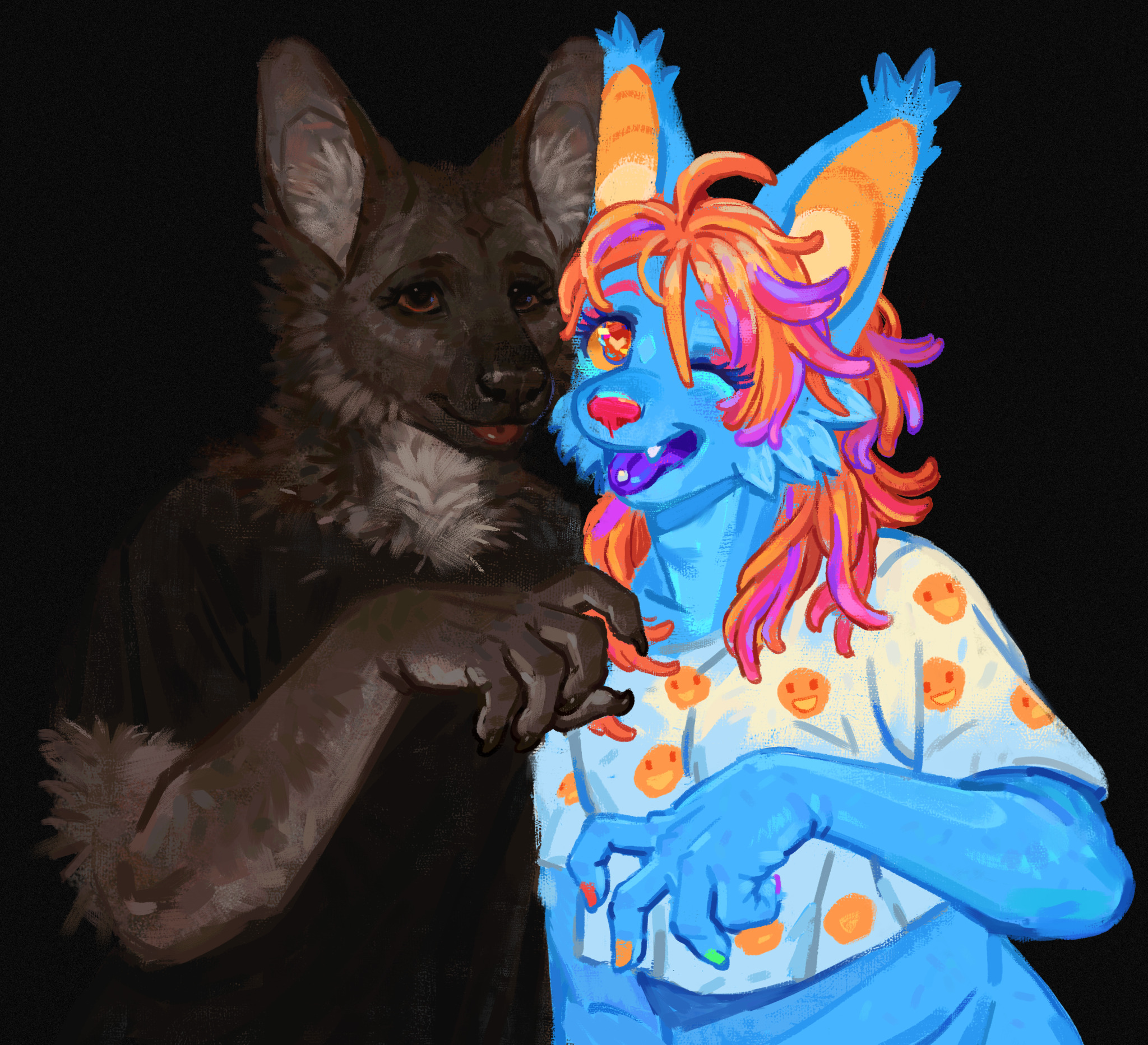
lets be awesome. together✌️😁
by CrazySodomite.Tumblr.com
This piece reminds me a lot of my own journey with self-expression through fursonas; going from the bright-neon avatars reflective of my aesthetic tastes, to naturalistic ones more reflective of my physical appearance, and coming to respect both of them. This was a trend I saw with a lot of artists I followed in the mid 2010s, and in lieu of the current internet hyperfixations on all things 2000s nostalgia and sparkle-dogs, I feel like there's a lot of people reflecting on what that transition truly symbolized. This piece seems to be in conversation with that, whether on a personal or community level, and it uses such a beautiful array of techniques to do so with a surreal but incredibly warm tone.
What I would call my quintessential 'sparkle-dog' sona was Neon the Pegasus, a white mare with light-blue hair and bright-pink eyes, and my sona throughout my tweens whose mark can still be felt on my artistic brand. But in 2017, she was replaced by the freshly designed Onion as my new sona. She was designed with a more contemporary furry trope of a naturalistic coat with splashes of neon highlights on the paws, ears, and such, and my primary goal with her was to represent myself - the pudgy little black girl with 4c hair and circles under her eyes - and not the rigid technicolor fantasy of my interests. Neon nor Onion perfectly align with those broader archetypes, Neon isn't scene enough, and the first Onion was still a bit too colorful, but their ethos and energy still translates I feel. And in a way I try to capture through their OC roles in Neonverse, with Onion being a bridge between Neon as symbol of pure fantasy, and myself as a day-dreaming child.
For myself, and I believe for a good amount of people, this transition was motivated by two things: an earnest reflection of growing self-awareness, self-consciousness, and self-actualization, and the typical growing pain of pushing away seemingly immature passions in an attempt to grow up faster - or in the shadow of Cringe Culture, be more acceptable. Past the veil of both phases, its easy to look back on the first and see that pure, carefree artistic expression from a bygone era of the internet and yourself as your truest self, and the second as that desperate attempt at conformity, but there is a superficial and valid element to both.
The artistic rule-of-cool explosion of the sparkle-dog-type is a genuinely misunderstood form of expression that is worth reflecting on and indulging in, but its important to see how it also flattens and overshadows your identity as an actual representation of the self. Especially for some artists of color who's likeness isn't present in a lot of the old tropes of the style. Likewise, the naturalistic sona can be a wonderful way to deconstruct and examine more intimate and authentic aspects of yourself, but it can absolutely come across as a frantic attempt to distance yourself from those more eccentric and freeing attitudes, and indirectly fed into a culture that intimidated many young artists.
This conversation I feel is delightfully captured within CrazySodomite's piece, and in such a light-hearted and inviting way. The composition, colors, and rendering are the biggest highlights for me. The difference between the two characters is incredibly stark on nearly every level, but they're mutually complimented by a neutral black background and this beautifully detailed but muddy rendering style interestingly used for both characters. I think that rendering style is what makes it so unique - I could easily imagine a version of this that used a stylistic clash along with the colors to make a more pessimistic statement I'd see from artists during that naturalistic transition and still to this day. The natural fur could've been a dark blemish lost in the fantasy of the sparkle-dog, or the sparkle-dog a distractingly radiant alien in the reality of the natural fur, but it goes for a less adversarial style that gives this piece its warmth.
The style is obviously the most complimentary of the natural fur, but even as it renders compromising details for the fantasy of the sparkle-dog, it makes many concessions for it rather than seeming to force it wasn't designed for. This isn't even to mention the colors, which could be seen as an aggressive dichotomy, but in the context of the other details it feels far more like letting both subjects shine without compromise. It's some of the most expressive use of style and color I've seen in a while, and its what inspired that analysis and reading above. That care and equity given to both subjects is a visual affirmation of that mature reflection on what these two modes of expression mean, and the place they both have in the ecosystem of the furry and artist community.
The way they mimic each others poses with their own personal levels of affect but equal enthusiasm is heart-melting as well, and for all my waxing about personal artistic growth, reminds me most of two old friends reuniting after years of developing apart. The piece can either be read as two types of furry united in awesomeness, or as that more internal snapshot I expressed, and I truly love that about it. It is so simple in theory, but is so detailed in execution and has made me emotional as hell since I first saw it. I am of course partial to my own reading, but I think it's a product of my isolation from the broader furry fandom, and seeing the more interpersonal reading makes me yearn for it as much as I cherish my own internal journey.
